So I finally have some time to rabbit on about NYC for a bit whilst I wait for some polymer clay to bake in the oven!
Day 1...
The first full day we had there we went to Hornet Inc. The studio was nothing like I expected, it was warm and cosy (although we were all soaked through, so eldon square bus station would have seemed like a fire-lit log cabin at that point) and so relaxed and laid back. Working there looked so much fun! The place was full of little goodies too, like the bunnies from the Sony Bravia advert.
We were taken into a small room, which I'm guessing was their editing room, they had a TV, presumably for reviewing final cuts etc, so we all huddled in around the TV to warm up, dry off and watch some of the studios work.
I'd already watched a few bits on the website so I was chuffed when they showed us Gabe Askew's video for Grizzly Bear's Two Weeks. The video is absolutely amazing and totally mesmerizing. When I first watched it I was trying to figure out what was stop motion, live footage and what was computer generated; turns out it's all computer generated, but to such a realistic standard that it looks as though he's made it out of cardboard. What was even more interesting was that the video, which isn't even the official video for the song, is what got Gabe the job at Hornet Inc. Just goes to show, you do something well enough and get it out there, the right person sees it and you're in!
It was only a brief visit, the guys had a lot to be getting on with, but it was really insightful and it was really cool of them to let a bunch of dripping wet students in to have a nosey and distract them from work for an hour or so.
Here's the Grizzly Bear video which you should definitely check out, they're an awesome band too so it's worth a listen. I just wish I'd made the video! It's something I've thought about a lot, making videos for songs by bands I love, and I have a few ideas, so I guess it's worth doing...
I'm just watching it again and I still can't believe it's all done in 3D on the computer!
For anyone who remembers this for a few years back, one of Hornet Inc's animators, Peter Sluszka animated this Michel Gondry video for Steriogram. There's some awesome bits in it like the knitted projector screen and the part where one of the band gets ripped in half. I really want to try something with knitting 'cause it's something else I love doing, here's the link for it on youtube, it won't let me embed it...
http://www.youtube.com/watch?v=y50Yao2jHJM&feature=related
That Afternoon we went to the MoMA but the Tim Burton exhibition had sold out, so we went back early the next day.
SO, Day 2...
The ticket for the Tim Burton exhibition had an allocated time on it so while we waited to go in we wondered around the rest of the galleries.
The top floor was an exhibition by Marina Abramović, a New York based Yugoslavian artist. I wasn't allowed to take photos in this exhibition... probably because there were a lot of naked people about! Her work was pretty crazy and I can't say I understood a lot of it, but it was still really interesting and certainly got your attention. Since getting back I've looked her up on the internet and read about some of her past works, a few of which were exhibitied at MoMA. One of these was The House With the Ocean View (2002) for which the artist lived for 12 days on three platforms in the Sean Kelly Gallery in New York. Her only way down from the platforms was ladder which had their rungs replaced with upturned butchers knives. Another of the pieces was Rhythm 0 (1974), for this Marina placed 72 items on a table with a sign informing the public that they could use the items on the artist any way they pleased. Objects included a knife, a pair of scissors, a whip and a gun with a single bullet. The artist allowed the public to manipulate her body and actions for 6 hours. Afterwards Marina said,
“The experience I learned was that…if you leave decision to the public, you can be killed.” ... “I felt really violated: they cut my clothes, stuck rose thorns in my stomach, one person aimed the gun at my head, and another took it away. It created an aggressive atmosphere. After exactly 6 hours, as planned, I stood up and started walking toward the public. Everyone ran away, escaping an actual confrontation."
Her art is really very interesting as a lot of it is almost like science or psychology experiments; looking at how the body reacts to certain medication (Rhythm 2, for which she took a pill which caused her to have seizures and incontrollable movements whilst her mind was still lucid for the first half of the performance, then for the second half she took a pill that left her immobilized mentally and afterwards had no memory of the elapsed time.) and, through Rhythm 0 above, human behaviour.
Marina was also present in the gallery, Performing in one of the open spaces, visitors could go up and sit at the table opposite her. according to the website she will be there throughout the duration of the exhibition (with a few exceptions) and you can watch the live feed of it on the website. http://www.moma.org/interactives/exhibitions/2010/marinaabramovic/
The following photos are of various pieces in the lobby and open spaces throughout the gallery...


The following photos are from Shaping Modernity: Design 1880 - 1980 and Action! Design over Time...
It was really interesting to see such old pieces of design in such close proximity to the new. Below is a Desk (1899) and Chair (1899 - 1900) by French Designer Hector Guimard, typical of the Art Nouveau period...
The next piece is something I really liked as it almost bridged the gap between the two areas in this room as it combined the old with the new. Dutch designers Danmakersvan used computer software to merge digital sketches of two antique tables to create this piece, which was then made by cutting the wood, using a computer driven machine, into thin sheets which were then assembled by hand...
Wo bist Du, Edison?... Hanging lamp 1997 by German designer Ingo Maurer features a 360-degree holographic light bulb, and the black socket above, which holds the halogen bulb which provides the light source, is a 360-degree profile of inventor Thomas Edison (though Icut this off the photo, oops). Apparently as you move round the lamp a final surprise will reveal itself, given it's location it was difficult to walk around and still see clearly (especially with my eyesight when I wasn't right up close to it) so I haven't a clue what it was! I did steal this info from a website though...
"The 360° hologram for the Ingo Maurer Wo bist Du, Edison, ...? suspension light is a type of hologram which has never been produced before in this form.
Over 2000 frames from a cine-film sequence are transferred by laser onto a special hologram film. The process takes 12 hours and is carried out at night when conditions are calmer.Any vibration would disturb the image transfer, so the equipment – weighing several tons – is mounted on an air-cushion.
The light bulb motif is stored in the film as an interference structure, an ultra-thin crystalline layer in which literally billions of microprisms refract the halogen light in such a way that the virtual image is recomposed as a visual whole"...
Below is Cabbage Chair by Oki Sato. This was created in response to fashion designer Issey Miyake to create a use for all the paper that was used during the fabric-pleating process of realizing his designs. The paper used is stiffened and made resilient by adding resins and is apparently deceptively comfortable, as well as sustainable...
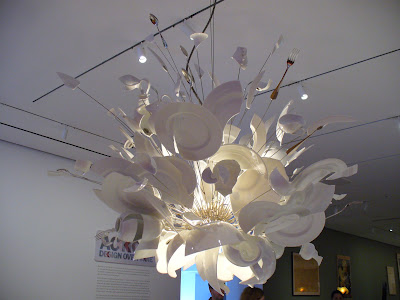
Porca Miseria! Chandelier, another piece by Ingo Maurer, is a revolt against the "sickness" of contemporary design and Maurer's celebration of slow-motion cinematic explosions... according to the plaque I read anyway. Only 10 of these are made a year because it take 4 builders at a time, almost 5 days to work on each one. "Porca Miseria" is an Italian expression, similar to exclaiming "Damn!" which represents both the annoyance and release that comes from smashing a plate or cup...
The following photos were all from an exhibition called Rising Currents: Projects for New York's Waterfront. This exhibiton was a combined effort by the MoMA and P.S 1 Comtemporary Art Centre to address the rising sea-level resulting from global climate change and exhibits the solutions of 5 teams from the architects-in-residence programme at P.S 1...
Below are a few more pieces from various exhibitions that I liked...
One Hundred Lavish Months of Bushwhack by Wangechi Mutu...
Pencil drawings by Jim Shaw from the Dream Drawing series...
I really liked these as he had filled the paper and I especially like the one below where he had drawn a second note book on the page with a drawing on...
The Illuminated Cannibal/ El Cannibal Illuminado by Enrique Chagoya...


 The last exhibition I went to in MoMA was the Tim Burton exhibition, but I'll do a separate post for that as this one is getting long enough!
 Alex from my course really wanted to see the New York Public Library so we managed to find it and had a brief nosy round it. It has to be one of the most gorgeous and lavish buildings I've ever seen. The fact that something like that is so accessible to the public is fantastic, and I wish I'd had my SLR and more time to take some better photos. There was so much detail in everything, even the chairs at the desks were beautifully carved. The whole place smelt awesome too, like old books and wood.


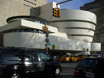
That afternoon we went to the Guggenheim. This building was also pretty awesome, though I didn't manage to get any good photos. We started at the top and worked our way down, the whole building is like a spiral and for once I actually wished I had a pair of those stupid wheelies 'cause that place was made for them!
There were a number of things I liked at the Guggenheim, Contemplating the Void was interesting as it invited artists, architects and designers to imagine their dream interventions in the centre of the buildings rotunda, submissions ranged from the wildly imaginative to the practical. It was different to see so much work that was based around the building it was being displayed in. One particular artist caught my eye but again I'll put that in another post, adding photos now will mess this post up...


No comments:
Post a Comment